
If you’ve ever bought wall art you absolutely loved in the store, only to hang it up and realize it looks completely wrong in your room, girl, this guide is for you.
There was a time when I thought choosing wall art was easy. If I liked it, I bought it. End of story.
Well… not exactly.
A few years ago, I fell in love with this gorgeous oversized floral print I found online. It looked stunning on Instagram, had thousands of positive reviews, and honestly felt like something straight out of Pinterest. I ordered it immediately without thinking twice.
Then it arrived.
I hung it above my sofa, stepped back, and instantly knew something felt off. The colors clashed with my rug, the scale overwhelmed the room, and somehow my living room looked more chaotic than stylish. My friend Jess came over later that week and politely asked if I was “trying a new look.” Lol.
That experience taught me one very important lesson: knowing how to choose wall art for your room is completely different from simply buying art you like.
The good news? Once I learned a few simple tricks, decorating became so much easier. My walls finally felt intentional, cohesive, and honestly way more expensive-looking than they actually were.
Today I’m sharing everything I’ve learned about how to choose wall art for your room so you can create a space that feels beautiful, balanced, and totally you.

Why Color Should Always Come First
One of the biggest reasons wall art feels disconnected from a room is color mismatch. This is why understanding how to choose wall art for your room starts with looking at your existing color palette.
Before shopping, I always take photos of my room. Seriously, it helps so much. I look at the dominant colors in my furniture, pillows, rugs, and decor and identify two or three shades I want to highlight.
The goal isn’t to match everything perfectly. That usually looks boring. Instead, choose art that repeats colors already present in your space while introducing a little contrast for interest.
My friend Emma recently redecorated her bedroom using soft beige, sage green, and cream tones. Once she selected artwork that incorporated those colors, the entire room instantly felt pulled together.
Quick Color Matching Guide
| Room Color Palette | Best Wall Art Colors |
|---|---|
| Neutral Beige & Cream | Black, gold, sage green |
| Gray & White | Navy, blush pink, charcoal |
| Earth Tones | Terracotta, olive green, rust |
| Coastal Blues | Sand, white, light gray |
| Modern Black & White | Bold abstract colors |
Why Size Matters More Than You Think
Oh my goodness, this might be the most overlooked part of how to choose wall art for your room.
Even beautiful artwork can look awkward if the size is wrong.
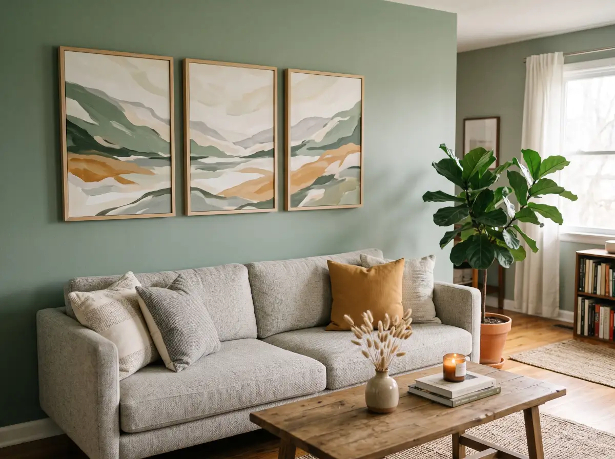
One of the most popular interior design rules is choosing art that fills approximately two-thirds to three-quarters of the wall space above furniture. This creates visual balance and makes the room feel professionally styled.
I can’t say enough about how much this changed my decorating game. Once I stopped buying tiny prints for huge walls, everything started looking intentional.
Wall Art Size Comparison
| Wall Situation | Recommended Art Size |
|---|---|
| Above Sofa | 60-75% width of sofa |
| Above Bed | 50-75% width of bed |
| Entryway Wall | Medium to oversized |
| Small Accent Wall | One statement piece |
| Large Empty Wall | Gallery wall or oversized art |
Pro Tip: Use painter’s tape to outline the artwork size on your wall before purchasing. I do this every single time now.
Why Your Room Style Should Guide Your Art Choices
When people ask me how to choose wall art for your room, I always tell them to think about the overall vibe first.
Your artwork should support the room’s personality, not compete with it.
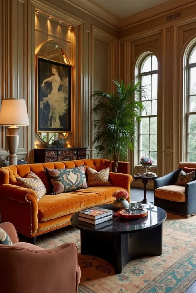
If your room feels modern and minimalist, abstract prints often work beautifully. If your space leans cozy and farmhouse-inspired, landscapes or vintage-inspired artwork may feel more natural.
This is actually one of the biggest trends on Pinterest right now. Rooms with a consistent design style tend to feel more expensive and curated.
Match Art to Your Style
| Room Style | Best Wall Art Types |
|---|---|
| Modern | Abstract prints |
| Boho | Textured art, nature prints |
| Farmhouse | Vintage signs, landscapes |
| Glam | Gold-accented artwork |
| Scandinavian | Minimal line art |
| Coastal | Ocean photography, beach scenes |
Personally, I’m seriously obsessed with oversized abstract pieces in modern spaces. They instantly create that designer-home look.
Why You Should Pay Attention to Mood
Here’s something most decorating guides don’t talk about.
Art affects how a room feels.
When learning how to choose wall art for your room, think about the emotional atmosphere you want to create.
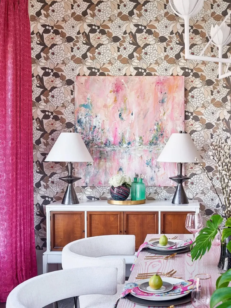
Soft landscapes and botanical prints often feel calming. Bright abstracts can energize a space. Black-and-white photography can feel sophisticated and timeless.
When I redesigned my home office, I intentionally chose artwork with soft blue tones because I wanted the room to feel peaceful instead of stressful.
Honestly, it made a bigger difference than I expected.
Why Trending Art Isn’t Always the Right Choice
Girl, I know how tempting it is.
You see a viral wall art trend on TikTok and suddenly you’re convinced you need it.
But one of the smartest lessons I’ve learned about how to choose wall art for your room is separating trends from personal style.
Just because a piece is trending doesn’t mean it belongs in your home.
I highly recommend asking yourself three questions:
- Would I still love this in two years?
- Does it work with my existing decor?
- Does it actually reflect my personality?
If the answer is yes to all three, you’re probably making a great choice.
Why Gallery Walls Can Solve Almost Any Decorating Problem
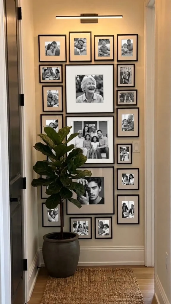
If you’re struggling with how to choose wall art for your room, a gallery wall can be your best friend.
Gallery walls are one of the most popular ideas on Pinterest because they’re flexible, customizable, and budget-friendly.
You don’t need expensive artwork either.
Mix family photos, printable art, travel memories, quotes, and illustrations. The combination creates a layered, collected-over-time look that’s incredibly stylish.
My friend Jess created an entire gallery wall using affordable printable art and thrifted frames. Everyone assumes it cost hundreds of dollars.
My Favorite Formula for Choosing Wall Art
Whenever I’m shopping for wall decor, I follow this simple formula:
40% room color palette + 30% room style + 20% room mood + 10% personal personality.
It sounds simple because it is.
Using this approach makes how to choose wall art for your room feel less overwhelming and more strategic.
The result is artwork that doesn’t just look pretty—it actually belongs in the space.
Unique Pro Tips That Most People Never Think About
One of my favorite tricks is viewing artwork in black-and-white before purchasing. This helps you evaluate composition and balance without getting distracted by color.
Another trick is placing all potential art choices into a Pinterest board first. If a piece still excites you after a week, it’s usually a keeper.
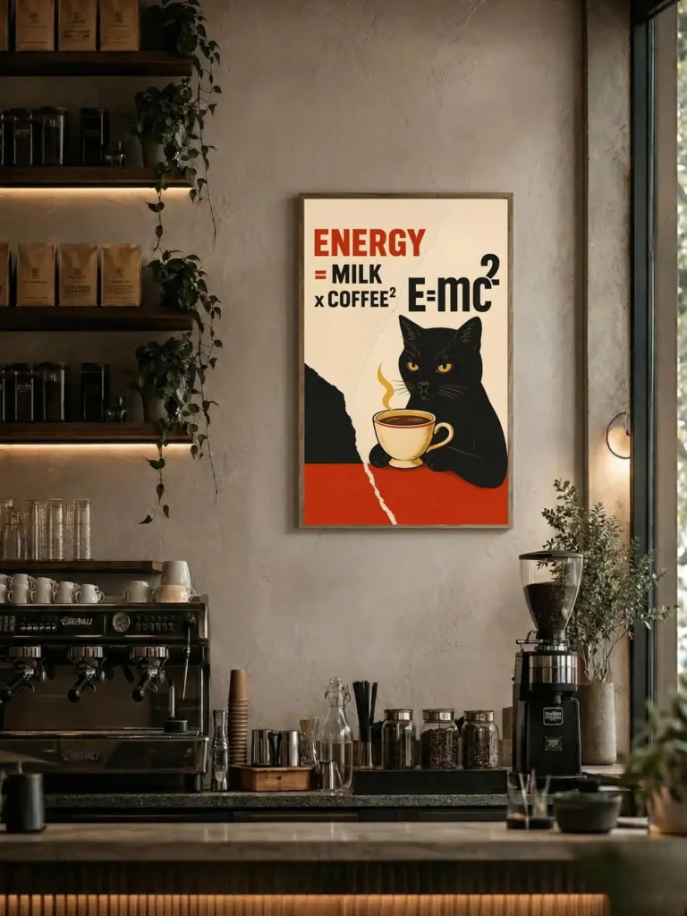
I also recommend mixing at least one unexpected piece into every room. Maybe it’s a quirky illustration, vintage photograph, or bold abstract print. Those unique touches often become conversation starters.
Final Thoughts
Learning how to choose wall art for your room isn’t about following strict decorating rules. It’s about creating a space that feels cohesive, comfortable, and uniquely yours.
Start with your room’s colors, consider the size carefully, match your overall style, think about the mood you want to create, and don’t get distracted by every viral trend you see online.
Trust me, once you understand how to choose wall art for your room, decorating becomes so much easier—and honestly, way more fun.
And remember, the best wall art isn’t necessarily the most expensive piece. It’s the one that makes you smile every time you walk into the room.
Happy decorating, girl!

Leave a Reply