The most inspiring and genuinely achievable cabinet color ideas that prove a can of paint and a weekend is all you need to completely transform your kitchen without spending thousands on a renovation.
Let me tell you the most underrated home transformation secret that designers have known for years and that most homeowners have no idea about: painting your kitchen cabinets is the single highest-return, lowest-cost kitchen upgrade available to any homeowner.
Nothing else — not new countertops, not new appliances, not new hardware — changes the feeling of a kitchen as completely and dramatically as cabinet color. And the cost? A few cans of good paint, the right prep supplies, and a weekend of your time.
I resisted this idea for years. I looked at my dated, yellowing oak cabinets and thought the only real solution was a full kitchen renovation — new cabinet boxes, new doors, new everything — which was going to cost tens of thousands of dollars I didn’t have.
My friend Celine changed my mind completely when she painted her own dark espresso kitchen cabinets a warm, creamy white one weekend and sent me a before-and-after that I genuinely could not believe showed the same kitchen. The cabinets were the same. The layout was the same. The countertops were the same. But the kitchen felt like an entirely different room — brighter, more modern, bigger, and more beautiful than it had ever looked before.
I painted my cabinets the following month. It was the best thing I have ever done to my kitchen, and it cost me less than $200.
The question most people have after deciding to paint their cabinets is: what color? And that question is both exciting and completely overwhelming, because the range of cabinet color ideas available spans everything from the safest whites to the boldest blacks to the most on-trend deep greens and moody blues and warm terracottas — and every one of them looks beautiful in the right kitchen with the right combination of countertop, hardware, and wall color.
This guide gives you 20 specific cabinet color ideas with honest guidance about when each one works best, what it pairs well with, and what kind of kitchen personality it creates. By the end you will know exactly which cabinet color is right for your kitchen. Let’s find it.
Before You Choose Your Color: The Three Things That Determine Which Cabinet Color Is Right for You
Before we get into the 20 ideas, three factors need to shape your decision — because the right cabinet color is not the most popular one on Pinterest, it is the one that works best with your specific kitchen’s existing elements.
Your countertop and backsplash: Your cabinets need to work with whatever countertop and backsplash you already have or plan to keep. White or light grey cabinets work with almost everything. Navy and dark green cabinets work best with lighter countertops to maintain contrast. Wood countertops love almost any cabinet color because the warm organic material bridges gaps. Busy, veined marble countertops need a calmer cabinet color that lets the stone be the star.
Your kitchen’s natural light: Light kitchens with large windows can handle dark cabinet colors without feeling cave-like. Dark kitchens with limited natural light almost always benefit from lighter cabinet colors that maximize the light that does exist. Painting dark cabinets in a basement or north-facing kitchen with a deep, moody color is a recipe for a space that feels oppressive rather than dramatic.
Your home’s overall style: Your kitchen cabinets should feel like they belong to the same design conversation as the rest of your home. A sleek navy cabinet in a coastal-modern home feels intentional. The same navy in a traditional, warm-toned home full of antique furniture might feel like an interloper. The right cabinet color feels like the kitchen has always belonged exactly where it is.
Now — with those three factors in mind — let’s look at all 20 ideas.
The 20 Best Cabinet Color Ideas for a Budget Kitchen Refresh
1. Crisp Bright White — The Classic That Never Fails
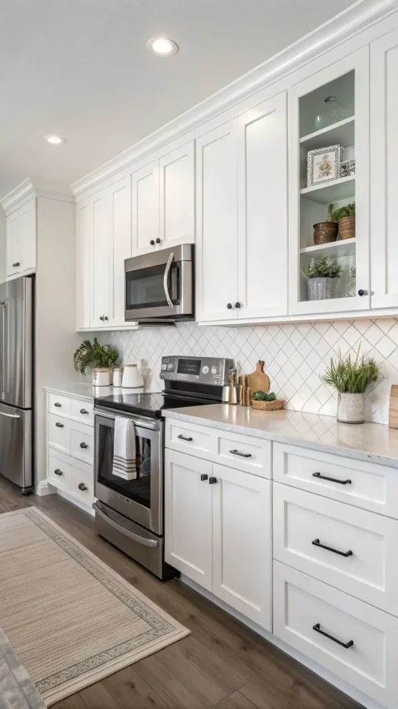
There is a reason bright white is the most popular cabinet color in kitchen design and has been for decades — it works everywhere, with everything, and it makes every kitchen feel cleaner, brighter, and more spacious than any other color choice.
Bright white cabinets reflect maximum light, which is particularly powerful in smaller kitchens or kitchens with limited natural light. They create a clean, timeless backdrop that lets your countertops, backsplash, and accessories be the visual stars. They make a kitchen feel new regardless of the age of the cabinets themselves. And they are genuinely forgiving of imperfections in the cabinet surface because the uniformity of a clean white coat smooths over a lot of texture variation.
The slight drawback of bright white is its visibility of dirt and scuffs — particularly on lower cabinets — which means it requires more frequent touch-ups in a busy kitchen with young children. A semi-gloss or gloss finish helps with cleanability but amplifies any imperfection in the paint surface.
Best paint picks: Benjamin Moore Chantilly Lace (OC-65) is the gold standard of crisp whites for cabinets. Sherwin-Williams Extra White (SW 7006) is the cool-bright option. Both are widely considered the best cabinet whites available.
Works best with: Any countertop material, any backsplash, any hardware finish. The most versatile cabinet color that exists.
2. Warm Creamy White — The Softer, More Inviting Alternative
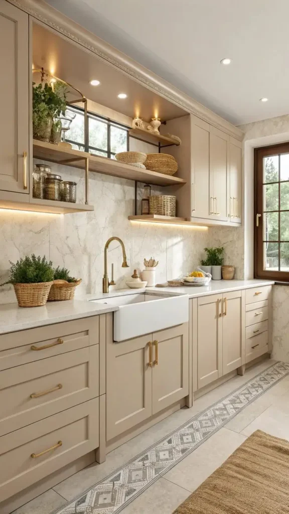
If bright white feels a little cold or clinical for the warm, inviting kitchen aesthetic you’re going for, warm creamy white is your answer — and it is the cabinet color idea I recommend most often for kitchens in older homes, cottages, and any space that wants to feel more lived-in and cozy than fresh and modern.
Warm creamy whites have undertones of yellow, peach, or beige that soften the starkness of a pure white and create a kitchen that feels genuinely welcoming rather than just clean. They work beautifully with warm wood tones, brass and gold hardware, and natural stone countertops with warm veining.
The key to getting a creamy white right is testing it in your specific kitchen’s light before committing — creamy whites with strong yellow undertones can look greenish in certain light conditions, and what looks warm and beautiful in the paint store can look slightly off in your kitchen.
Best paint picks: Benjamin Moore White Dove (OC-17) is the most beloved warm white in the design world — soft, creamy, and universally flattering. Sherwin-Williams Alabaster (SW 7008) runs warm and slightly greige, which reads beautifully in traditional kitchens. Farrow and Ball’s All White is a cleaner warm white with a beautiful depth.
Works best with: Warm wood tones, brass hardware, natural stone, warm-toned tile backsplash, farmhouse and traditional kitchen styles.
3. Classic Light Grey — The Modern Neutral That Replaced White
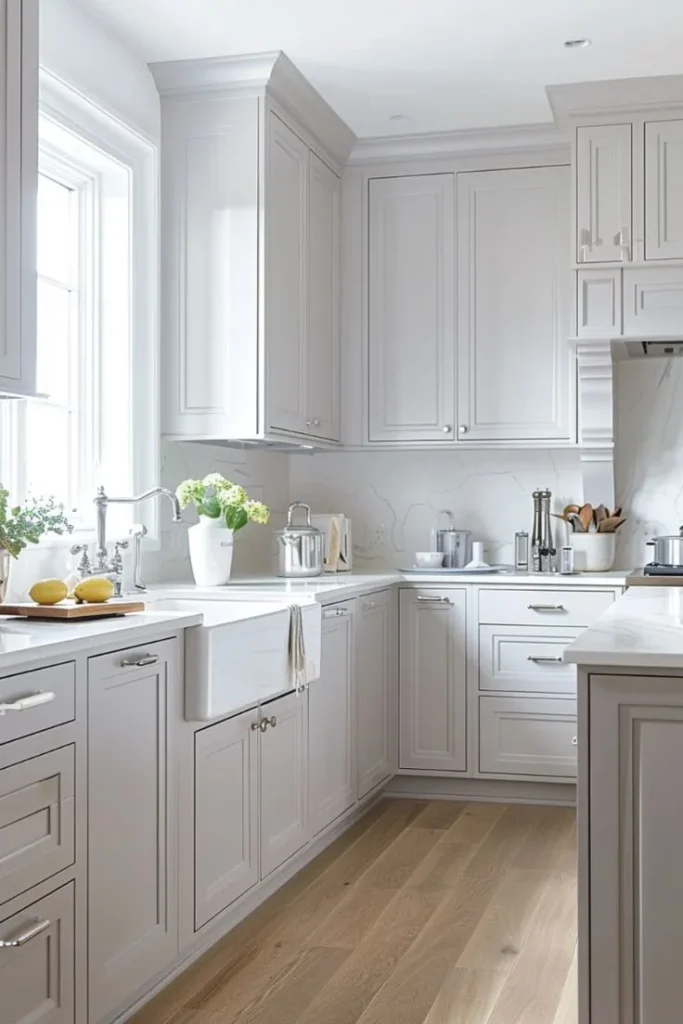
Light grey had its moment as the dominant kitchen cabinet color throughout the 2010s and early 2020s, and while the most oversaturated versions of the trend have faded, a genuinely beautiful light grey cabinet is still a classic, sophisticated, and timeless cabinet color idea that works in modern kitchens with a depth and refinement that white doesn’t always achieve.
Light grey cabinets feel more design-forward than white without the commitment of a true color — they are still a neutral, still universally flexible, but with a slightly more intentional quality that says “I made a considered choice here.” They work beautifully with white or off-white countertops, with polished chrome or brushed nickel hardware, and with cool-toned subway tile backsplashes.
Be cautious of grey paints with strong undertones — a grey with too much purple reads pink in certain light, and a grey with too much green reads khaki. Test on the actual cabinet surface in your actual kitchen’s light before committing.
Best paint picks: Benjamin Moore Pale Oak (OC-20) — technically a greige that reads as very light grey in most lights. Sherwin-Williams Repose Gray (SW 7015) — the most popular grey paint in the United States and genuinely excellent for cabinets. Benjamin Moore Revere Pewter (HC-172) — a warmer, mid-grey that works beautifully in transitional kitchens.
Works best with: White and marble countertops, chrome and brushed nickel hardware, subway tile backsplash, modern and transitional kitchen styles.
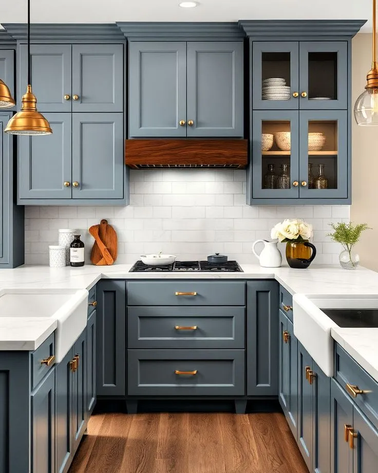
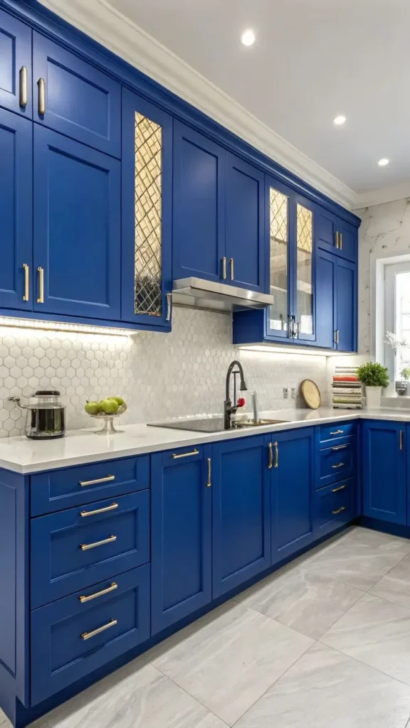
4. Navy Blue — The Bold Classic That Reads as Luxurious
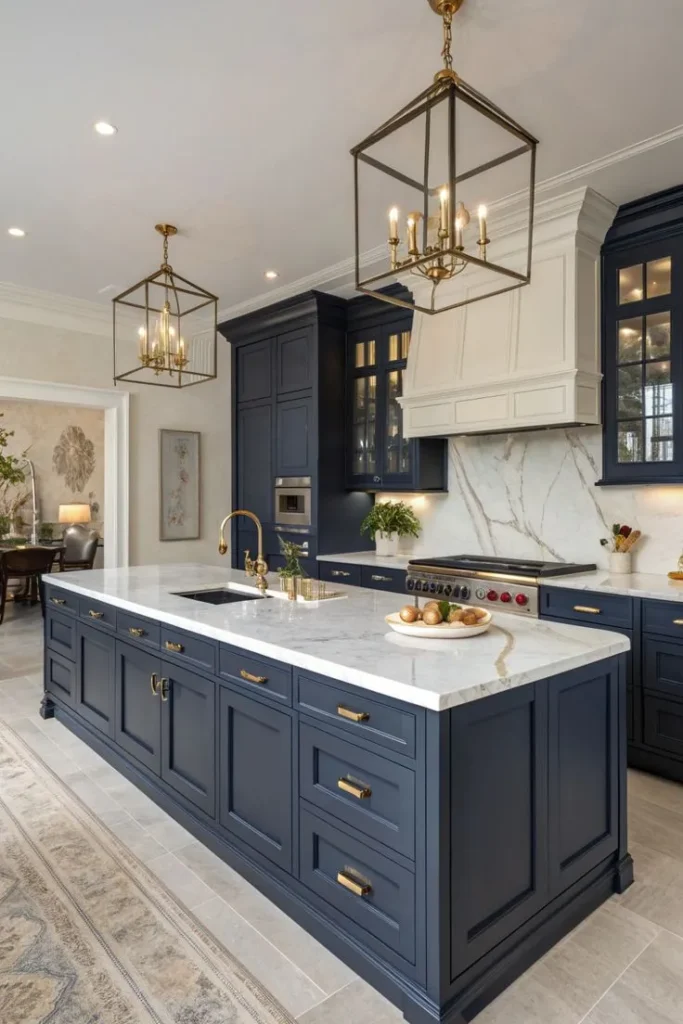
Navy blue kitchen cabinets are one of those cabinet color ideas that seemed daring when they first appeared on the scene and have since proven themselves as a genuine classic — a bold, beautiful choice that makes a kitchen feel deeply sophisticated and genuinely luxurious without the maintenance concerns of very dark colors.
Navy is deep enough to make a dramatic visual statement but familiar enough to feel timeless rather than trendy. It is particularly beautiful in kitchens with white or light countertops — the contrast is striking and elegant — and it pairs with brass or gold hardware in a way that feels genuinely expensive.
Navy works best in kitchens with adequate natural light or good artificial lighting. In a very dark kitchen it can feel heavy, but in a well-lit kitchen it creates a depth and richness that is hard to achieve with any other color.
Best paint picks: Benjamin Moore Hale Navy (HC-154) — the most famous navy in home design, consistently beautiful on cabinets. Sherwin-Williams Naval (SW 6244) — a softer, slightly more muted navy that photographs beautifully. Farrow and Ball Hague Blue — a greenish navy with extraordinary depth.
Works best with: White marble and quartz countertops, brass and gold hardware, white subway tile or simple backsplash, coastal, modern farmhouse, and classic kitchen styles.
5. Sage Green — The On-Trend Color That Feels Timeless
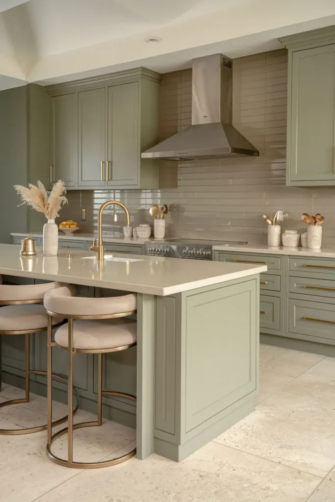
Sage green is having the single biggest moment in kitchen cabinet color right now and it genuinely deserves every bit of the attention — because a well-chosen sage green is one of those rare cabinet color ideas that feels simultaneously on-trend and completely timeless, simultaneously fresh and deeply restful.
Sage green brings the organic calm of nature into a kitchen. It is warm enough to feel inviting, muted enough to feel sophisticated, and connected enough to natural greens to feel genuinely grounding. In a kitchen with wooden accents, natural stone, and warm-toned hardware, sage green creates an atmosphere that is almost impossibly cozy and beautiful.
The wide range of what gets called “sage green” means you need to be careful — some sages lean grey and cool, some lean yellow and warm, some lean darker and more olive. Test multiple options in your light to find the one that is right for your specific kitchen.
Best paint picks: Sherwin-Williams Clary Sage (SW 6178) — the most popular sage for cabinets, warm and earthy. Benjamin Moore Aganthus Green (HC-120) — a slightly darker, more sophisticated sage. Farrow and Ball Mizzle (No. 266) — a complex, grey-leaning sage with extraordinary depth.
Works best with: Wooden countertops, brass and unlacquered brass hardware, natural stone backsplash, warm flooring, farmhouse and organic-modern kitchen styles.
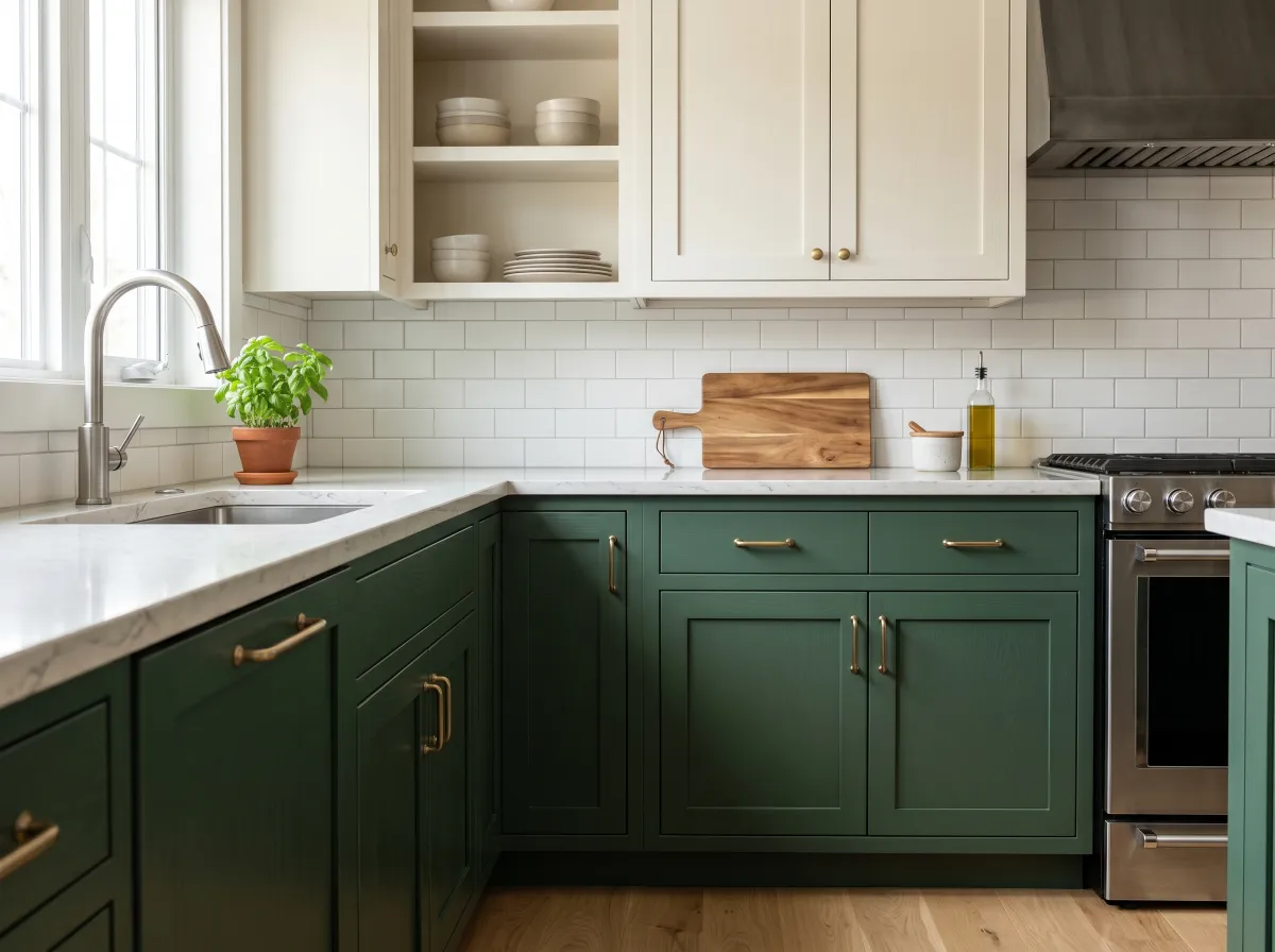
6. Forest Green — The Dark, Dramatic Statement Color
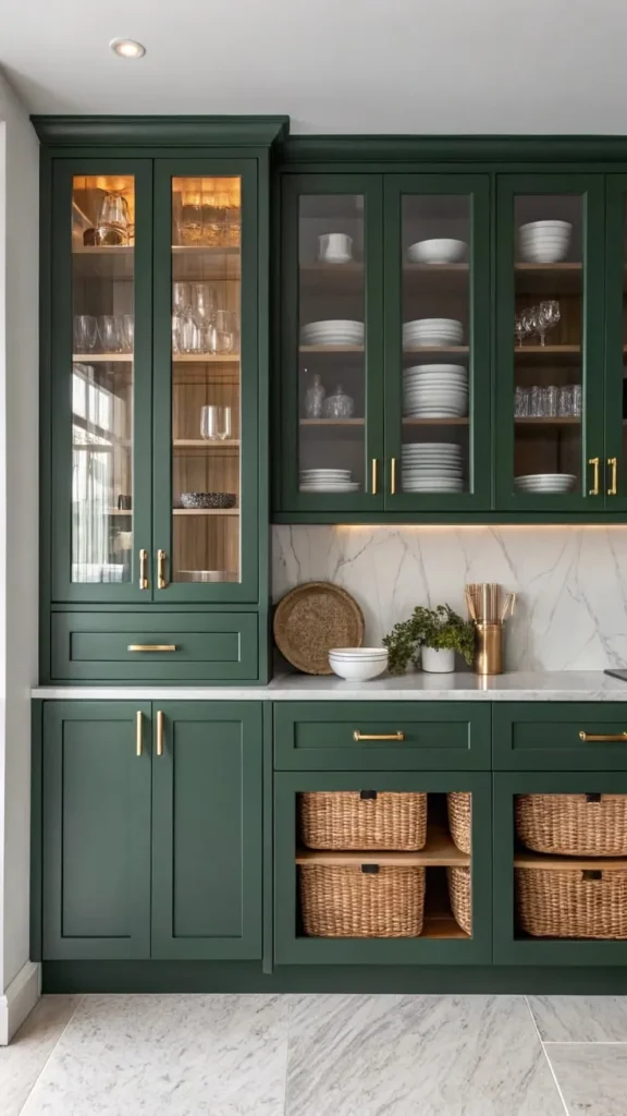
If sage green is the soft, restful version of green for kitchens, forest green is the bold, dramatic version — and it makes a cabinet color statement that is genuinely breathtaking in the right kitchen.
Forest green cabinets paired with brass hardware and a marble or white stone countertop is one of the most striking cabinet color combinations in contemporary kitchen design. The deep color creates a sense of richness and warmth that no lighter color can replicate, and the jewel-like quality of a well-lit forest green cabinet is genuinely beautiful.
This color needs good lighting to perform at its best. In a well-lit kitchen it creates drama and luxury. In a poorly lit kitchen it absorbs what little light exists and makes the space feel small and dark. Natural light or good artificial lighting is non-negotiable with forest green.
Best paint picks: Farrow and Ball Calke Green (No. 80) — a rich, complex forest green with brown undertones. Benjamin Moore Forest Green (2047-10) — a deeper, more saturated option. Sherwin-Williams Hunt Club (SW 6468) — a slightly lighter forest green that is a little more forgiving in lower-light kitchens.
Works best with: Marble and white stone countertops, brass hardware, white or cream walls and backsplash, well-lit kitchens with generous natural light.
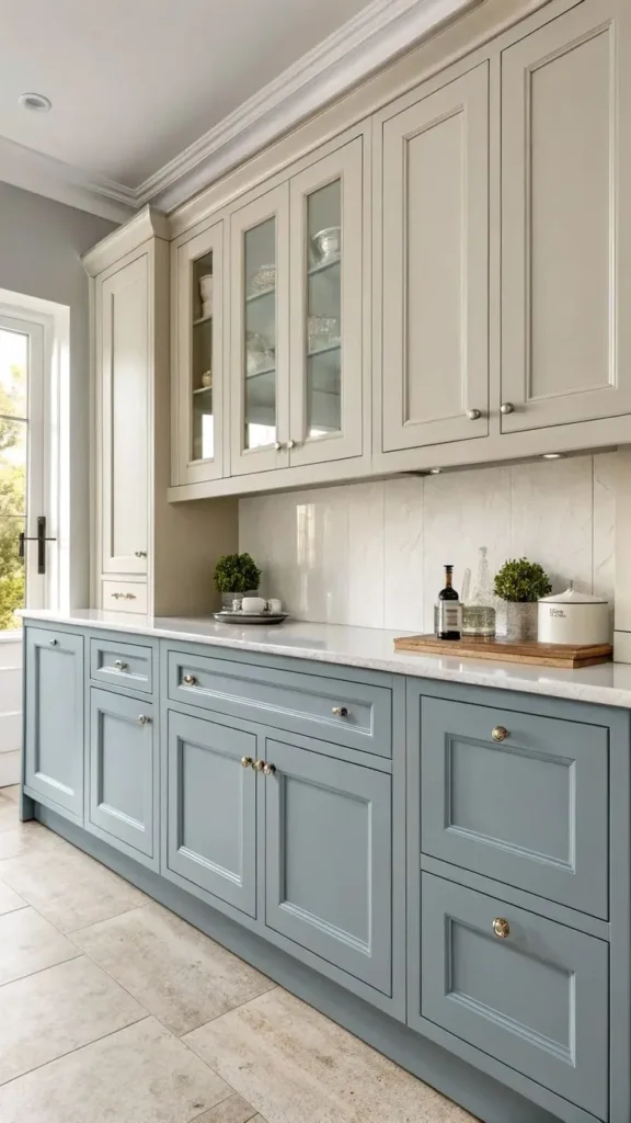
7. Dusty Blue — The Gentle, Charming Alternative to Navy
Dusty blue is the softer, more approachable cousin of navy blue — and it is the cabinet color idea for people who love the idea of blue cabinets but find navy a little too bold or a little too formal for the kitchen atmosphere they want to create.
Dusty blue is muted, slightly grey-toned, and wonderfully calm. It creates a kitchen that feels cottage-like, coastal, and genuinely charming in a way that is very hard to describe but immediately recognizable when you walk into a space that has it. It works beautifully with white countertops, with natural wood, and with white or cream subway tile.
Dusty blue is also one of the most forgiving cabinet colors for lower-light kitchens — its soft, muted quality means it doesn’t absorb light the way deep saturated colors do, and it doesn’t look flat the way a very light color might.
Best paint picks: Benjamin Moore Van Deusen Blue (HC-156) — a soft, greyed blue that is almost universally flattering on cabinets. Sherwin-Williams Watery (SW 6478) — a lighter, airier dusty blue. Farrow and Ball Lulworth Blue (No. 89) — a beautiful, complex blue with green undertones.
Works best with: White and cream countertops, chrome and brushed nickel hardware, white subway tile, coastal, cottage, and traditional kitchen styles.
8. Warm Terracotta — The Earthy, Unexpected Choice That Photographs Beautifully
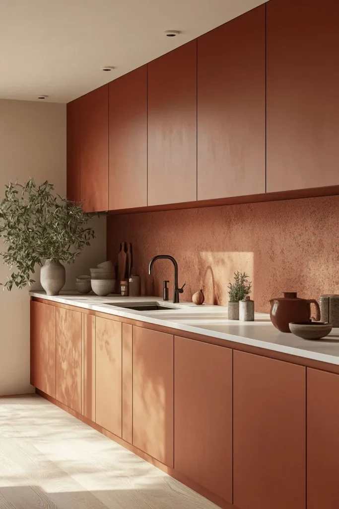
Terracotta cabinet color is the recommendation that makes some people immediately confident (“yes, that is exactly what I want”) and others immediately nervous (“that sounds like a lot”) — and I want to make the case for the nervous camp because a well-executed terracotta kitchen is one of the most beautiful and personality-rich kitchen environments imaginable.
Terracotta cabinets are warm, earthy, and deeply personal. They reference the natural world — clay, earth, sunset — in a way that makes a kitchen feel genuinely alive and rooted. Paired with warm wood countertops, cream or off-white walls, and brass hardware, a terracotta kitchen creates an atmosphere that is simultaneously bohemian and sophisticated.
This is not the color for a minimalist, cool-toned kitchen. It is the color for a kitchen full of plants, natural materials, handmade ceramics, and warmth.
Best paint picks: Benjamin Moore Firenze (2171-30) — a warm, sophisticated terracotta. Sherwin-Williams Cavern Clay (SW 7701) — the most popular terracotta cabinet color, warm and earthy. Farrow and Ball Red Earth (No. 64) — a deeper, more saturated terracotta with extraordinary richness.
Works best with: Warm wood countertops, brass hardware, cream and warm white walls, natural stone and terracotta tile backsplash, bohemian and organic-modern kitchen styles.
9. Charcoal Grey — The Moody, Sophisticated Dark Neutral
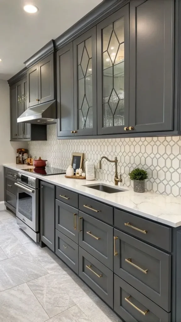
Charcoal grey cabinets are the sophisticated, moody alternative to black — all the drama and depth of a very dark cabinet color without the absolute finality of black, and with a slightly softer, more versatile quality that works in more kitchens than pure black does.
Charcoal grey creates a kitchen that feels serious, grown-up, and deeply sophisticated. It is particularly beautiful in contemporary kitchens with stainless steel appliances, white or light grey countertops, and minimal, clean-lined design. It also works beautifully in industrial-style kitchens where the dark palette is part of an intentional design language.
Like all dark cabinet colors, charcoal grey requires good lighting to look its best — and requires accepting that it will show fingerprints and smudges more readily than lighter colors.
Best paint picks: Benjamin Moore Kendall Charcoal (HC-166) — a beautiful, complex charcoal with slight warm undertones. Sherwin-Williams Peppercorn (SW 7674) — the most popular charcoal for cabinets, versatile and sophisticated. Benjamin Moore Iron Mountain (2134-30) — a slightly darker, cooler charcoal.
Works best with: White and light grey countertops, stainless steel and brushed nickel hardware, white or grey backsplash, contemporary and industrial kitchen styles.
10. Matte Black — The Bold, Graphic Statement
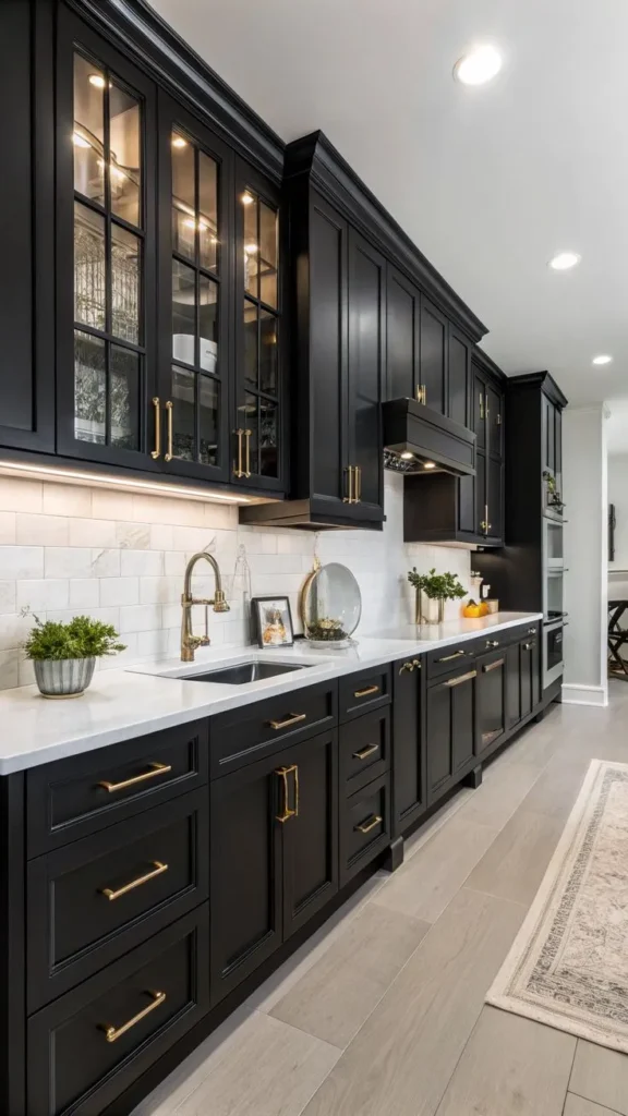
Black kitchen cabinets are not for everyone, and they are not for every kitchen — but in the right space, they are genuinely one of the most dramatic and stunning cabinet color ideas available. All-black or black-and-white kitchen combinations have a graphic power and a design confidence that is almost unmatched.
Black cabinets work best in kitchens with a significant amount of contrasting light — white countertops, white walls, large windows — so the black reads as a bold design choice rather than a dark, heavy weight. In a kitchen with light countertops and brass hardware, black cabinets create one of the most timeless and striking combinations in interior design.
Black shows fingerprints and dust more than any other color, which is the practical consideration that keeps many people from committing to it despite loving the aesthetic. A matte finish helps somewhat — it is less fingerprint-reflective than a semi-gloss black.
Best paint picks: Sherwin-Williams Tricorn Black (SW 6258) — the most popular black for cabinets, true and clean. Benjamin Moore Black (2132-10) — a deep, rich black with almost no undertone. Farrow and Ball Railings (No. 31) — a dark navy-black that is slightly softer than pure black.
Works best with: White marble and quartz countertops, brass or gold hardware, white walls and backsplash, very well-lit kitchens with generous natural light, contemporary and industrial kitchen styles.
11. Greige — The Warm Neutral That Bridges White and Grey

Greige — the blend of grey and beige that is neither definitively one nor the other — is one of the most sophisticated and universally flattering cabinet color ideas available, and it is the answer for anyone who finds pure grey too cool and pure white too stark.
Greige cabinets have a warmth that grey lacks and a refinement that beige can miss. They create a kitchen that feels calm, sophisticated, and genuinely timeless — appropriate in a farmhouse kitchen and equally at home in a modern one. They work with warm and cool countertop tones because they bridge the gap between the two.
Best paint picks: Sherwin-Williams Accessible Beige (SW 7036) — a warm greige that photographs beautifully. Benjamin Moore Pale Oak (OC-20) — a light, warm greige. Farrow and Ball Elephant’s Breath — a complex, beautiful greige that leans slightly cool.
Works best with: Almost everything — this is the most universally compatible cabinet color on the list. Especially beautiful with warm wood and natural stone.
12. Soft Lavender — The Unexpected, Joyful Choice
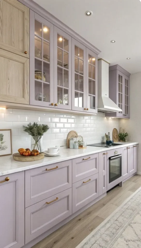
Soft lavender is the cabinet color idea that surprises people — and then absolutely delights them — because it is unexpected enough to feel genuinely personal and original, and soft enough to feel livable rather than like an experiment.
Soft lavender kitchen cabinets create a kitchen with personality, joy, and a lightness that no neutral can replicate. They work beautifully with white countertops, with brass hardware, and with white or cream walls that let the lavender be the star. They create a kitchen that makes people smile when they walk in.
Best paint picks: Benjamin Moore Violet Mist (1418) — a beautiful, soft lavender. Sherwin-Williams Violet Verbena (SW 6836) — a slightly more saturated lavender. Farrow and Ball Brassica (No. 271) — a sophisticated, muted purple-grey.
Works best with: White countertops, brass hardware, white or cream walls, cottagecore and maximalist kitchen styles.
13. Warm Butter Yellow — The Cheerful, Sunny Statement
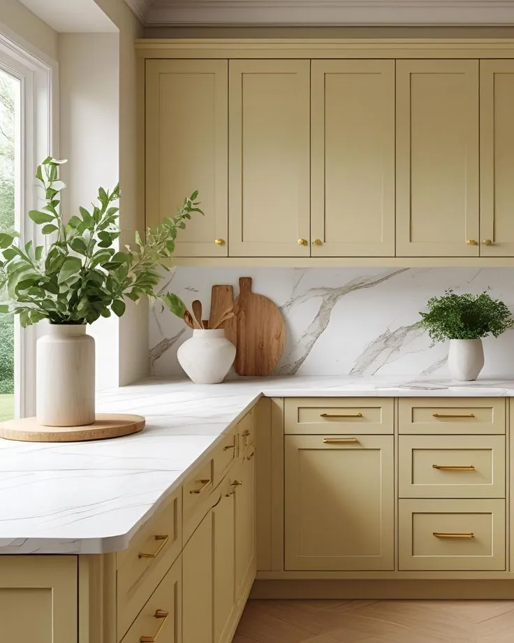
Butter yellow kitchen cabinets are one of those cabinet color ideas that creates an immediate emotional response — a kitchen with soft yellow cabinets feels sunny and cheerful and genuinely happy in a way that is almost impossible to achieve with any other color.
The key is choosing the right yellow — not a saturated, crayon yellow, but a soft, muted, almost-creamy butter yellow that feels warm and organic rather than loud and aggressive. This is a color for people who want their kitchen to make them smile every single morning.
Best paint picks: Benjamin Moore Pale Yellow (2024-60) — a soft, creamy butter yellow. Sherwin-Williams Butter Up (SW 6681) — warm and muted. Farrow and Ball Hay (No. 37) — a complex, dark yellow with extraordinary depth.
Works best with: White and cream countertops, brushed nickel and chrome hardware, white tile backsplash, cottagecore and farmhouse kitchen styles.
14. Teal — The Rich, Unexpected Jewel Tone
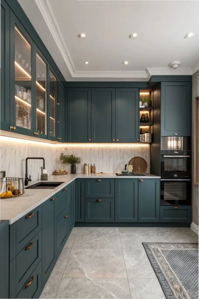
Teal cabinet color is for the design-confident homeowner who wants their kitchen to feel like a genuine expression of personality — rich, unexpected, and completely distinctive. Teal sits at the intersection of green and blue, which gives it a complexity and depth that neither color achieves alone.
Teal cabinets pair beautifully with brass hardware in a combination that feels simultaneously vintage and contemporary. They work with white countertops for maximum contrast or with warm wood countertops for a more organic, earthy combination.
Best paint picks: Farrow and Ball Vardo (No. 288) — a beautiful, complex teal. Benjamin Moore Sea Salt (2123-40) — a softer, more muted teal. Sherwin-Williams Tidewater (SW 6477) — a lighter, airier version.
Works best with: White marble countertops, brass hardware, white walls, white tile backsplash, maximalist and eclectic kitchen styles.
15. Two-Tone Cabinets — One Color on Top, Another Below
Two-tone cabinets are not a single color idea but rather the cabinet color strategy that uses two colors — typically a lighter color on the upper cabinets and a darker or bolder color on the lower cabinets — to create a kitchen with visual interest, architectural definition, and a custom, designed quality that single-color cabinets rarely achieve.
The most classic two-tone combination is white upper cabinets with a colored lower — navy, forest green, sage, charcoal — which grounds the kitchen visually while keeping the upper portion light and airy. This combination adds depth to a kitchen without the full commitment of all-dark cabinets.
Other beautiful combinations: greige uppers with terracotta lowers for a warm, earthy palette. White uppers with black lowers for a graphic, high-contrast statement. Cream uppers with dusty blue lowers for a cottage-kitchen charm.
Best approach: Start with the lower cabinet color — that is the bolder or more unusual choice — and choose an upper cabinet color that either contrasts cleanly (white or cream against any darker lower) or harmonizes (a lighter version of the same color family as the lower).
16. Pale Blush Pink — The Soft, Romantic Choice
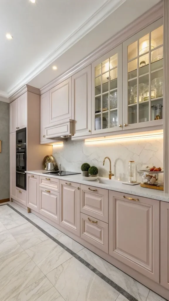
Pale blush pink kitchen cabinets are a cabinet color idea for a very specific aesthetic — and in that aesthetic, they are absolutely stunning. A kitchen with pale blush cabinets, marble countertops, brass hardware, and warm white walls creates an atmosphere that is genuinely romantic and beautiful.
The key is keeping the pink extremely pale — almost neutral, almost white, with just the softest warm pink flush. Anything more saturated starts to read as very obviously pink, which is a kitchen personality that not everyone shares.
Best paint picks: Benjamin Moore Pink Damask (2173-60) — a barely-there blush. Sherwin-Williams Mellow Coral (SW 6340) — a slightly more present blush pink. Farrow and Ball Peignoir (No. 286) — a complex, sophisticated blush with grey undertones.
Works best with: Marble countertops, brass hardware, warm white walls, white backsplash, maximalist and romantic kitchen styles.
17. Deep Burgundy — The Rich, Unexpected Dark
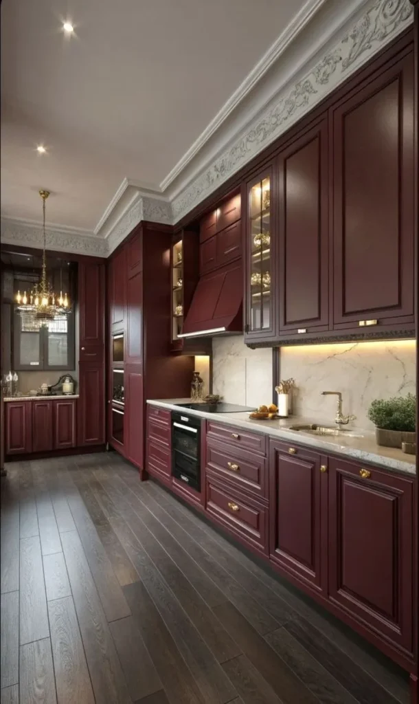
Burgundy kitchen cabinets are genuinely underused as a cabinet color idea and I think they deserve significantly more attention — because a deep, muted burgundy kitchen is one of the most sophisticated and original color environments in contemporary kitchen design.
Burgundy is rich, warm, and complex in a way that black and navy are not. It references traditional color palettes — Victorian, Arts and Crafts, Jacobean — while feeling completely contemporary when executed with modern hardware and clean-lined design.
Best paint picks: Farrow and Ball Preference Red (No. 297) — a muted, sophisticated burgundy. Benjamin Moore Dark Burgundy (2083-20) — a deeper, more saturated option. Sherwin-Williams Antique Red (SW 7587) — a slightly lighter burgundy-red.
Works best with: White and cream countertops, brass and unlacquered brass hardware, warm wood elements, well-lit kitchens.
18. Limewash White — The Textured, European Kitchen Aesthetic
Limewash technique applied to kitchen cabinets creates a matte, slightly textured, European-farmhouse cabinet aesthetic that is completely different from a standard painted white cabinet — and if the organic, imperfect, lived-in quality of a limewash finish appeals to you, it is one of the most beautiful and distinctive cabinet color ideas on this list.
Limewash creates a soft depth of color that regular paint cannot replicate — the finish has variation, movement, and a slightly translucent quality that looks more like a material than a coating. On kitchen cabinets it creates an atmosphere that feels genuinely aged, warm, and characterful.
Best paint picks: Portola Paints Limewash in Roman White or Venetian Plaster White. Roman Clay paint in warm white tones can achieve a similar textured finish.
Works best with: Raw wood countertops, black iron hardware, terracotta or stone tile, farmhouse and European kitchen styles.
19. Glossy Cobalt Blue — The High-Impact Statement
Glossy cobalt blue cabinets are the cabinet color idea for the genuinely bold and design-confident homeowner who wants a kitchen that is an event — a space that is memorable, striking, and completely un-ignorable.
Cobalt blue in a high-gloss finish reflects light dramatically and creates a kitchen that feels simultaneously retro and futuristic. It is a very specific aesthetic that pairs beautifully with clean, minimal design, white countertops, and chrome hardware.
Best paint picks: Benjamin Moore Cobalt Blue (2063-20). Sherwin-Williams Loyal Blue (SW 6510). Rust-Oleum cabinet paint in cobalt for a budget gloss option.
Works best with: White marble and quartz countertops, chrome hardware, white walls, minimal and contemporary kitchen styles.
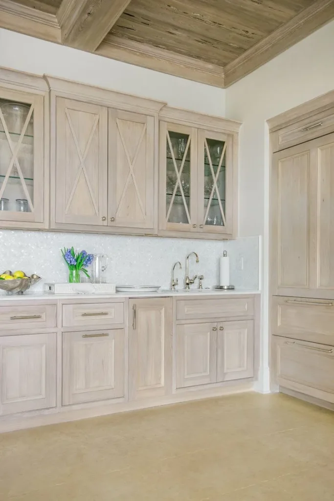
20. Unpainted Natural Wood — The No-Paint Cabinet Refresh
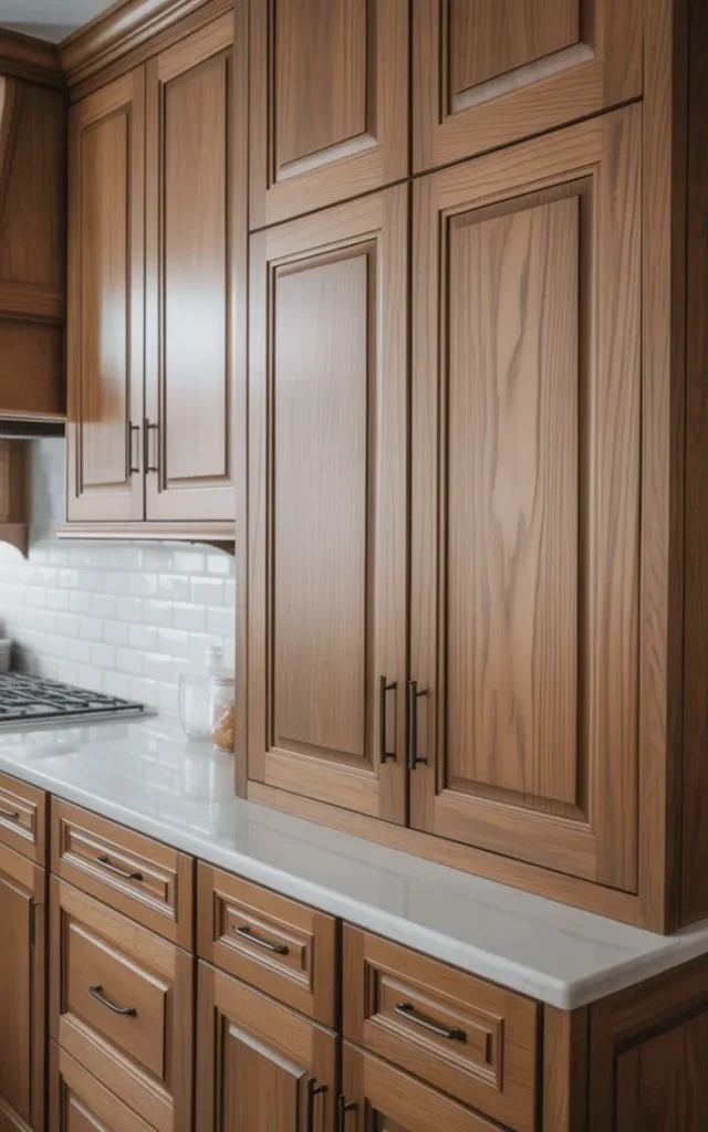
The final cabinet color idea on this list is the one that involves no paint at all — and it is the choice for homeowners whose cabinets are wood and who want to strip back to or reveal the natural beauty of the wood grain rather than cover it.
Stripped, sanded, and refinished natural wood cabinets — with a fresh coat of oil, wax, or clear sealant to protect and enhance the grain — have a warmth, depth, and organic quality that painted cabinets cannot replicate. In a kitchen designed around natural materials, wood cabinets are the most authentic and most beautiful choice.
This approach works best when the wood itself is attractive — tight grain, good color, no major damage. Oak, walnut, cherry, and maple all have beautiful grain patterns that reward stripping back. Pine and low-quality engineered wood look better painted than natural.
Best finish options: Rubio Monocoat for a flat, natural oil finish. Osmo Polyx-Oil for a slightly more protective option. Beeswax furniture polish for a traditional, soft-sheen finish.
Works best with: Natural stone and wood countertops, black iron and unlacquered brass hardware, terracotta and stone tile, farmhouse and organic-modern kitchen styles.
Choosing Your Cabinet Color: The Quick Decision Framework
With 20 cabinet color ideas on the table, here is the fastest way to narrow to the right one for your kitchen.
If your kitchen is small or dark: Light colors — white, cream, greige, soft grey, dusty blue. These maximize available light and make the space feel larger.
If your kitchen has good natural light and you want drama: Dark colors — navy, forest green, charcoal, black, burgundy. These need light to perform and reward with extraordinary visual depth.
If you want timeless over trendy: White, warm cream, greige, navy, sage green. These are the colors designers consistently return to because they age beautifully.
If you want personality and joy: Terracotta, teal, butter yellow, lavender, cobalt blue, dusty blue. These are the colors that make a kitchen feel like it belongs to a specific, interesting person.
If you want to add visual interest without full commitment: Two-tone cabinets. You get color and contrast with the insurance of a lighter upper half.
Your Kitchen Transformation Is One Weekend Away
I want to end this guide where I started it — with the reminder that painting your kitchen cabinets is genuinely one of the highest-return, lowest-cost home transformations available to any homeowner. The colors on this list span from the safest, most universally flattering whites to the boldest, most personality-rich statements — but they all share the same fundamental truth: a fresh coat of the right color on your kitchen cabinets will make your kitchen look and feel like a completely different, significantly better space.
My friend Celine’s before-and-after still stops me in my tracks when I scroll past it. Same cabinets. Same kitchen. One color change. Completely transformed. That transformation is waiting for you too — in whichever of these 20 cabinet color ideas speaks to your kitchen’s personality and your own.
Now go pin every single one of these cabinet color ideas, share this with whoever is currently staring at their dated kitchen cabinets and trying to decide what to do about them, and go get your paint samples and start testing colors on your cabinet doors this weekend.
Pin this complete guide and save it — every single one of these 20 cabinet color ideas is here whenever you are finally ready to transform your kitchen with nothing but paint and a weekend!

Leave a Reply